A Predictive Review: A Text Analysis of Amazon Reviews

Introduction:
How reliable are product reviews, and can written text determine how favorable a review is? Using a sample of 3 million Amazon reviews, this analysis attempted to predict customer product ratings using written reviews. To understand the success and shortcomings of this analysis, this report will be broken down into 5 sections and they are as follows:
- Process Section: describing the methodology of the analysis
- Sentiment Section: analyzing the polarity of Amazon Reviews
- Dimension section: discussing the dimension reduction techniques used for modeling
- Clustering & Token Frequency Section: describes the results from the clustering process & describes the tokens most common to each star rating.
- Modeling Section: discussing the results from making predictive models
Process:
The flow chart above (figure 1) shows the methodology and plan for obtaining the best possible models and clusters for the amazon review data. Before diving too deep into the process, it is worth quickly discussing the distribution of ratings for Amazon. A quick distribution check revealed that the classes for the star ratings are relatively balanced which luckily alleviates potential imbalanced class issues. As the methodology map above shows, the first step was creating document term matrices (DTMs) and Polarity Scores. This analysis used three types of DTMs: L1, L2, and Frequency distributed. While creating DTMS, polarity scores for each review were also calculated using Vader and text blob. After creating DTMs, TSNE was then employed, which will later be used for clustering. After TSNE, DTMs were split into train and test, and from there PCA, LLE, Sparse PCA, and UMAP were used to reduce dimensions. The Second to last stage used GridSearchCV to tune parameters and determine what features to hold constant for further evaluation. After the initial parameter search, it was determined that the L1 DTM and XgBoost algorithm provided the best model. After determining the best algorithm and DTM, feature selection and final tunings took place. The final models were tested on multiple samples taken from a data pipeline.
Sentiment:
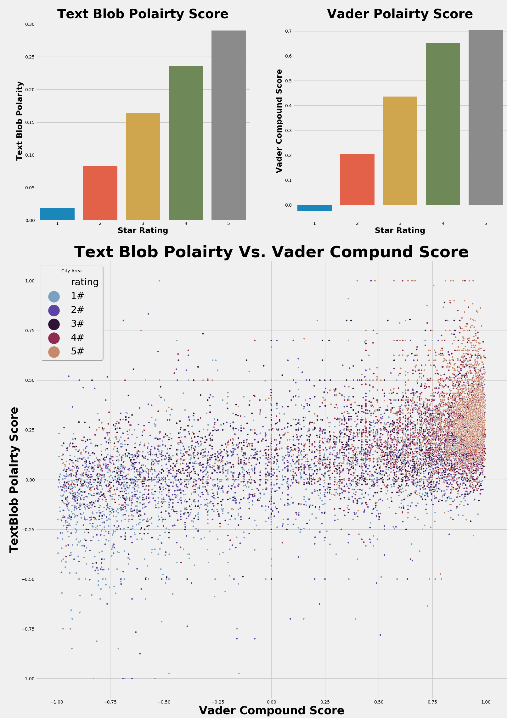
To analyze the polarity of each Amazon review two natural language processing APIs were used: Vader and TextBlob. The results from Vader and TextBlob can be found in figure 2. As the bar charts in figure 2 show, Vader and TextBlob were able to identify a difference in the average ratings by polarity scores. Analyzing the bar charts, it is quite evident that five-star and one-star ratings are vastly different from one another. Comparatively, Vader seems to have performed slightly better than TextBlob. For one, Vader’s distribution seems to be more accurate for one would expect four- and five-star to be more closely related, and there also seems to be a greater disparity between five-star and one-star ratings as expected. Looking at the scatter plot which compares Vader and TextBlob polarity scores, the Vader axis seems to show greater separation between the different ratings when compared to TextBlob. Although Vader performed better then TextBlob, it is worth quickly mentioning that the difference between the two seems marginal, and both perform relatively well.
Dimension Reduction:
Dimension reduction was an important piece in the machine learning process for the DTM’s created contained 2,000 sparse features. Given the size of the DTMs, the curse of dimensionality would become an issue in the model building process. To deal with the curse of dimensionality, this analysis employed 5-dimension reduction techniques: PCA, Sparse PCA, LLE, UMAP, and TSNE. The following discussion will analyze the results from LLE, UMAP, and TSNE.
UMap:One of the first techniques used was UMap, and the results from this process can be found in figure 3. UMap was unable to separate star ratings, but it did seem to make about four clusters. The UMap graph below has UMap Component one on the X-axis and UMap component two on the Y-axis. Beneath the individual UMap instances in the graph, there is a density plot showing areas were observations appear the most. As shown in the graph, there seem to be at least 5 individual clusters within the two UMap components. The tuning process for this algorithm was simple. First, a graph was made like the one below, and then individual parameters were tuned until the graph displayed tight groups with the most amount of distance between groups. The key parameters for this algorithm were ‘n_neighbors=50’ and ‘metric='cosine'’. As a side note, I have found that the cosine metric tends to work the best on sparse matrices

LLE:
The Local Linear Embedding technique often performs well in unrolling manifolds, and the LLE graph in figure four may show a manifold structure within the matrix (this is only a hypothesis). Although not as apparent as UMap, there does seem to be some natural dense regions within LLE, and this may be revealing hidden patterns within the sparse data frame which may prove to be beneficial in the machine learning process. Tuning for this algorithm was like the tuning process for UMap. Several parameters were changed until groupings with the greatest densities and furthest separations were found. The finale parameters for this algorithm were ‘n_neighbors=40’.

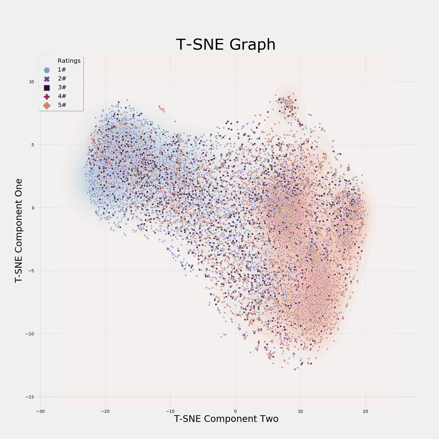
TSNE:
Unlike the other graphs, the TSNE graph contains two density graphs. The red density graph is for five-star ratings, while the blue density graph is for one-star ratings. As shown in the graph, there seems to be a clear separation between five-star ratings and one-star ratings. Due to the nature of TSNE (stochastic & non-parametric), I won’t be able to use these results in a supervised setting (due to the structure of my program), but I believe the clustering process may find these results important. The tuning process for this algorithm was like the other algorithms, and the finale parameter were: “perplexity=250”.
Clustering & Token Frequency:
How do these reviews come together, and can star ratings be defined by certain tokens? This section explores what tokens most commonly occur in each star rating, and whether unsupervised learning can group together these star ratings.
Token Frequency:
>
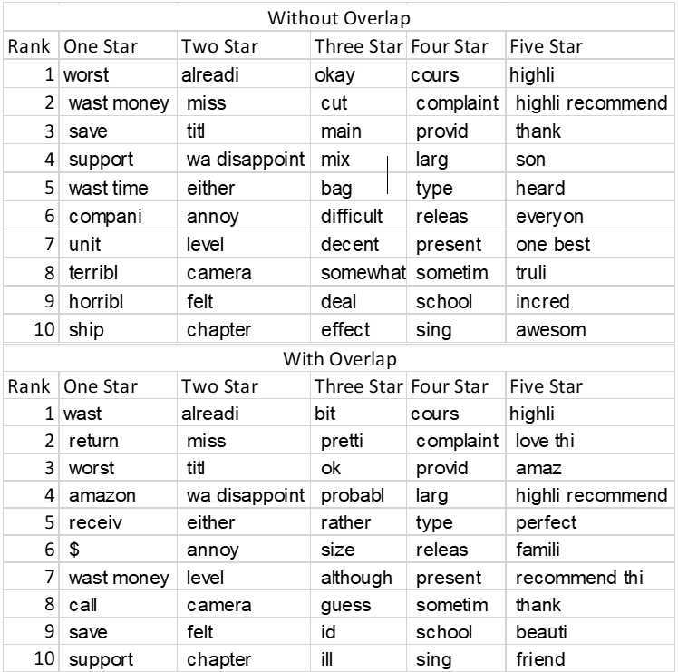
Below are tables of the most common words associated with each star rating. There are two table types. The first table, “Without Overlap”, shows words for each star rating that no other word has in its top 300 most frequent words. The second table, “With Overlap”, allows for over overlap if it is one-star rating away (one star can overlap with two-star, but not three-star). As shown in the tables, the words associated with one-star rating tend to be negative words such as waste, worst, terrible, while five-star most frequent words tend to be positive words such as highlight, one ‘of the’ best, and awesome. The most frequent words make sense given the sentiment analysis previously done. The words in one-star ratings are negative while the words in five-star ratings are positive.
Clustering:
Clustering was used to see if it was possible in an unsupervised setting to group together star ratings. Three techniques were used for the clustering process: k-mean, DBSCAN, and HDBSCAN. The results from this clustering exercise were unsuccessful at parsing out different star ratings. All algorithms were extensively tuned with various parameters changed with different features, but no method proved successful. The clusters for the different star ratings were uniform for all algorithms (equal stars in each cluster) which suggest that these reviews cluster around different criteria. In the future, perhaps a deeper dive into the clusters that where formed could shed some light on the issues with clustering. Perhaps the clusters that have formed are coming together on different criteria such as product type or location.
Modeling:
After reducing dimensions and calculating polarity scores, this analysis had the data frame it needed to start building models. The modeling process took part in three stages: initial model selection, for determining the best model and DTM; tuning and feature selection, fine-tuning the chosen algorithm and picking the best features; and finalization and testing, determining the validity and practicality of the model.
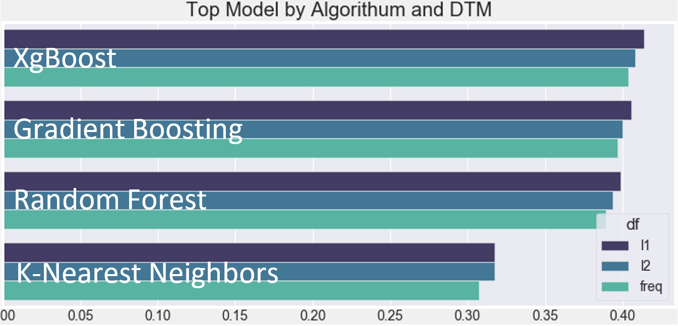
Initial Model Selection:The first task, arguably the most daunting, was trying to narrow down the search area for the models. The initial search looked at: four different algorithms, K-Nearest Neighbors, Random Forest, Gradient Boosting, and XgBoost; three DTMS, L1 DTM, L2 DTM, and Frequency DTM; and three to four different parameters per algorithm. In total, about 1,500 different models were fit over the span of eight and a half hours. Figure 5 displays the results from the model selection process, and from this information, this analysis determined that the L1 matrix and the XgBoost algorithm created the best model. As shown in figure 5, the XgBoost algorithm and the L1 DTM simply had the best models. Additionally, over 75% of the top 20 models were composed of either the L1 matrix, XgBoost or both and because of this, moving forward XgBoost and the L1 matrix will be held constant.
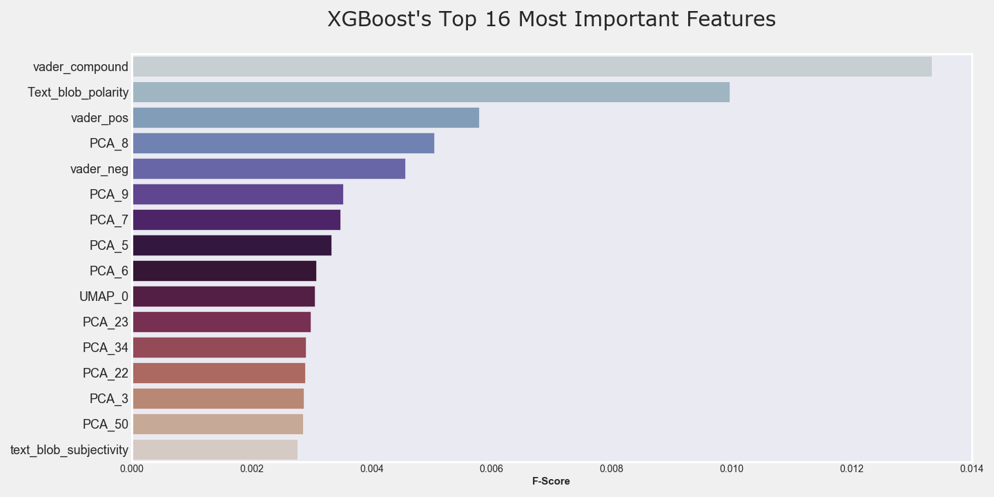
After searching for the best initial models, it was decided to do a deeper dive into feature selection and parameter tuning. The first grid-search exposed XgBoost to all possible features while varying various parameters, and this took around 7 hours. After the initial grid-search was done, XgBoost’s feature importance module was then used, and the results from this module can be found in figure six. As shown in figure six, the top features came from the sentiment analysis which was expected given how well Vader and TextBlob did in parsing out average user ratings. UMap was also a top feature, which was once again expected given the clusters in the UMap graphs. LLE and Sparse PCA did not end up as a top feature. The next step in the algorithm tuning process consisted of exposing XgBoost to varying amounts of top features. The first iteration exposed XgBoost to the top 50 features which was then followed by exposing XgBoost to the top 100, 150 and 200, 300, and 400 features. In summary, it was found that the models exposed to the top 200 features tended to consistently perform better than the other models.
Due to a lack of processing power, this analysis could only take 10,000 samples out of the original 3 million, and because of this, the validity of train and test came into question. To address the issue of train test validity, this analysis built a data pipeline that took random samples from the original data frame and tested it on the built model. This method allowed for stringent testing on the finale model and allowed this analysis to see how well the model would generalize. In summary, the finale XgBoost had a train score of 42% accuracy and an average test score of 38% accuracy.
Summary:
The overall accuracy is, at the very least, poor. The current XgBoost model performs only marginally better than random chance. More work obviously needs to be done in order to make this model better at predicting. Bringing in new features could improve the model’s accuracy. It would be expected that features such as location, product type, and purchase date would affect customer review ratings. There could also be additional features that could be created via feature engineering, such as polarity for the title of the review, most common words by ratings, and binning polarity scores. Combining four- and five-star reviews could also improve the accuracy of the final model. The conjecture is that the difference between four- and five-star ratings is slight, and therefore, any model would find it difficult to differentiate four- and five-stars ratings. Any one of the techniques mentioned could greatly improve upon the model’s overall predictive capabilities.